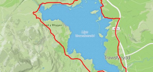
Run Comparison
Just a quick little video clip using Ascent to compare my two recent runs around a hilly loop that I do.
The blue dot and lower graph represent my run on June 27th 2012 where I beat my personal best for this route by a massive 2 mintes and 5 seconds with a time of 52:23.
The yellow dot and upper graph represent my run on July 11th 2012 where I managed to knock a further 16 seconds off with a time of 52:07.
As you can see, I started off a little slower the second time around but managed to catch myself up on the final climb and then sprinted away at the end for the win!
Discover more from A Simple Life of Luxury
Subscribe to get the latest posts sent to your email.
Sponsors.
If you would like to sponsor me and get some positive exposure for your business at the same time, please get in touch or use the donate button below. I'll do my best to make it worth your while.I'm currently racing for Scimitar Sports Racing Team and Beet-it Sport